> For the complete documentation index, see [llms.txt](https://docs.webtonative.com/llms.txt). Markdown versions of documentation pages are available by appending `.md` to page URLs; this page is available as [Markdown](https://docs.webtonative.com/website-plugins/bubble.io/offercard.md).
# Bubble.io Offer Card Guide
Configure Offer Cards with the WebToNative Bubble.io plugin. Show a video/image card to your users for discounts or offers or information.
### Overview
The **Offer Card Action** lets you display a customizable card in your app. This card can show text, colors, and content like images or links, making it easy to grab users' attention with an actionable offer.
***
### **How It Works**
1. **Card Settings**:\
You configure the card's appearance and behavior using these settings:
* **Action URL**: The link to the button will open when clicked.
* **Button Text Color**: The text color of the button.
* **Button Background Color**: The background color of the button.
* **Button Text**: The text is displayed on the button (optional).
* **Card Size**: The size of the card (`SMALL`, `MEDIUM`, or `LARGE`).
* **Card Position**: Where the card appears (`LEFT` or `RIGHT`).
* **Card Background Color**: The background color of the card.
* **Content Type**: The type of content shown on the card (`IMAGE and VIDEO`).
* **Content URL**: The URL of the content (e.g., an image or video).
* **Offer Card ID:** You must provide an offer card ID to use the scheduling feature. You can use any valid ID.
* **Show Again In (Duration)**: Controls how long the offer card remains hidden before it can be shown again (Number).
* **Show Again In (Unit)**: days/minutes/hours
***
### **How to Set It Up**
1. **Add the Action**:\
In your Bubble workflow, add the "Offer Card" action.
2. **Fill Out the Settings**:\
Enter the values for the card properties (e.g., button color, content type).
3. **Preview the Card**:\
The card will appear based on your settings and can be customized further.
***
### **Example Workflow**
1. **Trigger**: When the page loads or a specific button is clicked.
2. **Action**: The Offer Card action is triggered and displays the card with the configured settings.
3. **Result**: The card is shown with the provided button and content, ready for user interaction.
***
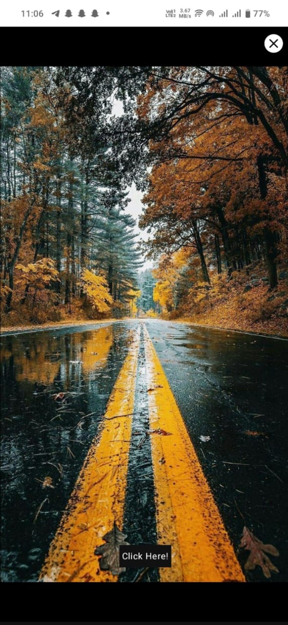
Full screen offercard
Small screen offercard
### **Example Use Case**
You want to promote a limited-time offer.
* Configure the Offer Card with an **image** as the content, and a **"Click Here"** button, and set the card to appear on the **left** side of the screen.
* When users click the button, they are redirected to the offer page.
This simple workflow ensures users see a visually appealing offer and can act on it easily!